NEGATIVE SPACE DRAWING
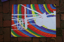
This is my negative space drawing. It has a lot of the elements of art. Line is one of them, there are many lines in this and they pop out. Also the lines separate the color and give shape to the drawing. Another element is color, without the color this image wouldn't be very interesting in fact, without it there wouldn't even be anything on the paper. I used complementary colors with it to make it stand out more. Another element is value, the value on this drawing is very bright and varies a lot. Also it makes the color and drawing be seen better. Another element is shape, the shape of this drawing is very important because it depicts the chair and shows it in the drawing. It also gives the background more notoriety. Finally, a fifth element is texture, the texture in this is rough and uneven. It is like this because I used chalk pastels and marker together which made it rough and a little weird.
VALUE DRAWINGS
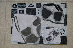
These are my value drawings. They all have a great range of value but the one I think has the best rendering of great range of value is the oil pastel one (top right) because it has the most different colors and shades of colors. We used three materials, graphite, oil pastel, and sharpie. My favorite was oil pastel because it was smooth and could make many different shades very easily. I think the most interesting square is the sharpie one because it was not easy making the different values with that material to me, so I had to change some things and figure out the right way to do it and I think it turned out great.
I think this drawing affects my personal style because it shows how I draw, how I use materials, and how I lay things out. I believe I was successful in this project because to me, it looks better than any of my other projects and I was able to put more time and effort into it. There were two things in this project that I learned that I didn't know; oil pastels can make really good shades, and sharpie looks better when it's in a small pattern than just scribbling it all in. If I ever had to do this project again, some things I would change are the object, the background, the sharpie pattern, and use more shading instead of lines
I think this drawing affects my personal style because it shows how I draw, how I use materials, and how I lay things out. I believe I was successful in this project because to me, it looks better than any of my other projects and I was able to put more time and effort into it. There were two things in this project that I learned that I didn't know; oil pastels can make really good shades, and sharpie looks better when it's in a small pattern than just scribbling it all in. If I ever had to do this project again, some things I would change are the object, the background, the sharpie pattern, and use more shading instead of lines
